Architectural Composition
Spring 2020 • Design Fundamentals • Illustration
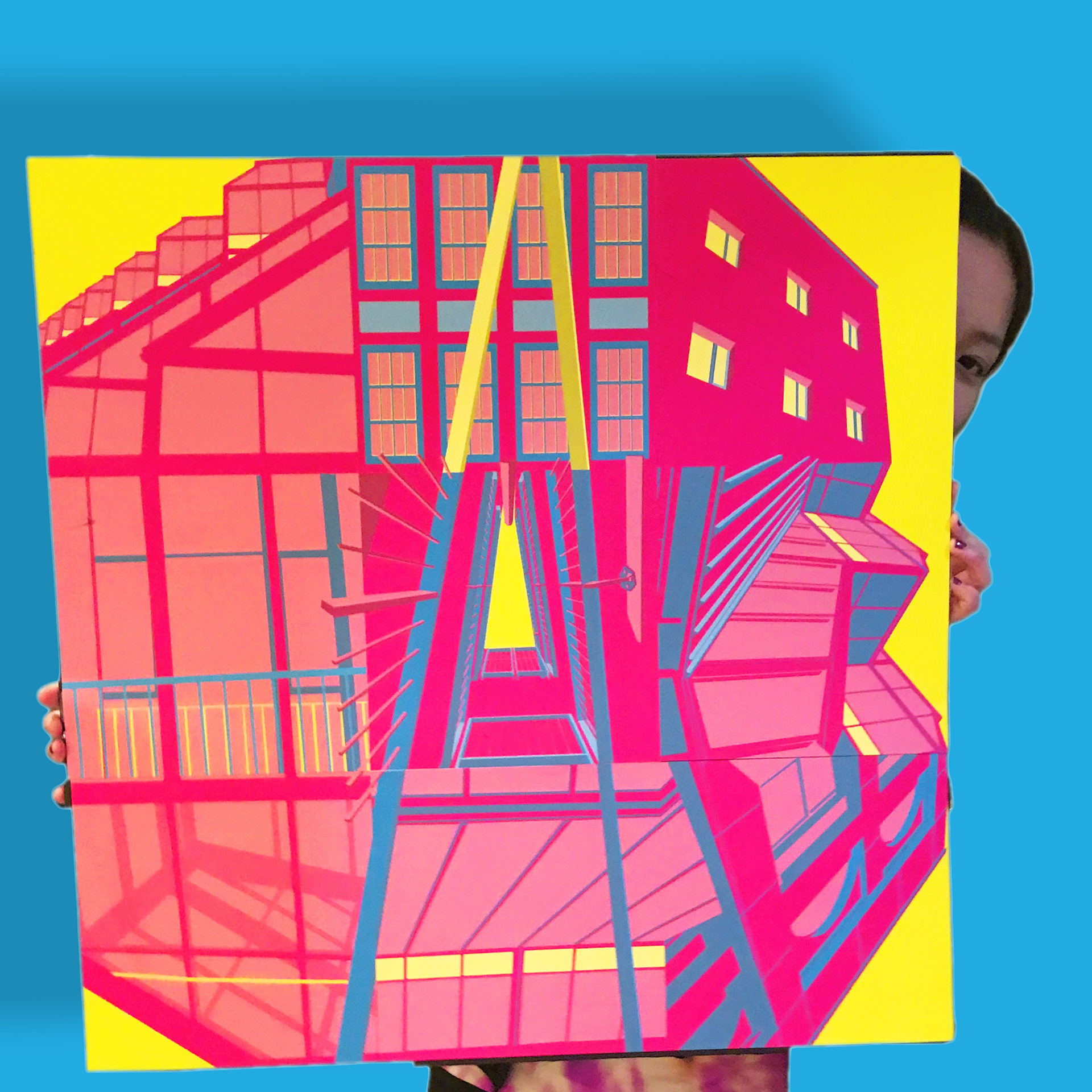
Printed Piece
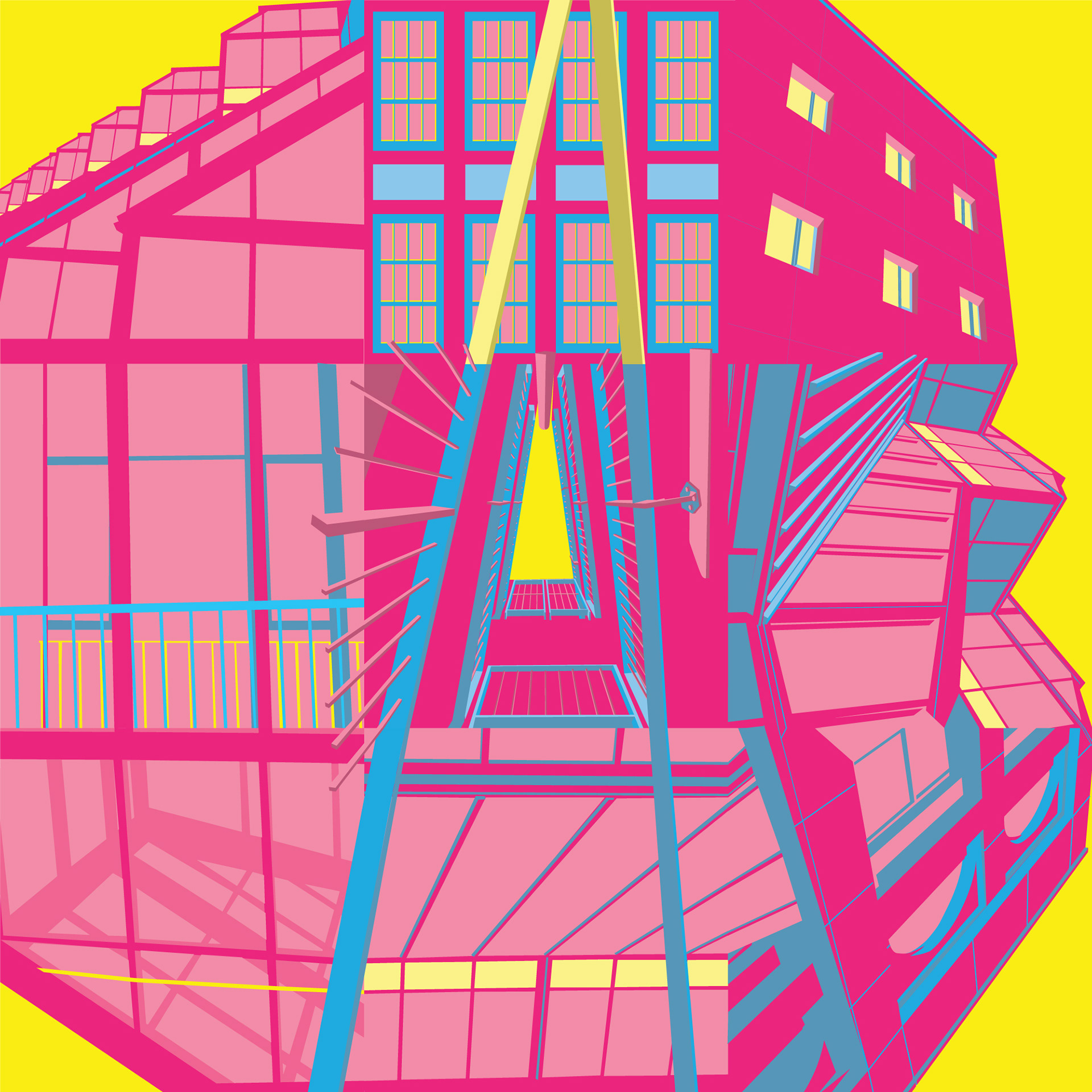
Final Design

Mockup
This was a project for a design fundamentals class where we utilized photographs of architecture we took on campus. The project was to create a 24x24–3x3 square layout with the photos. The aim was to utilize the pen tool and all of the things we’ve learned in design fundamentals thus far, to create a cohesive layout with a 3 color scheme. My goal was to challenge myself, but also to create something that could be fun to look at.
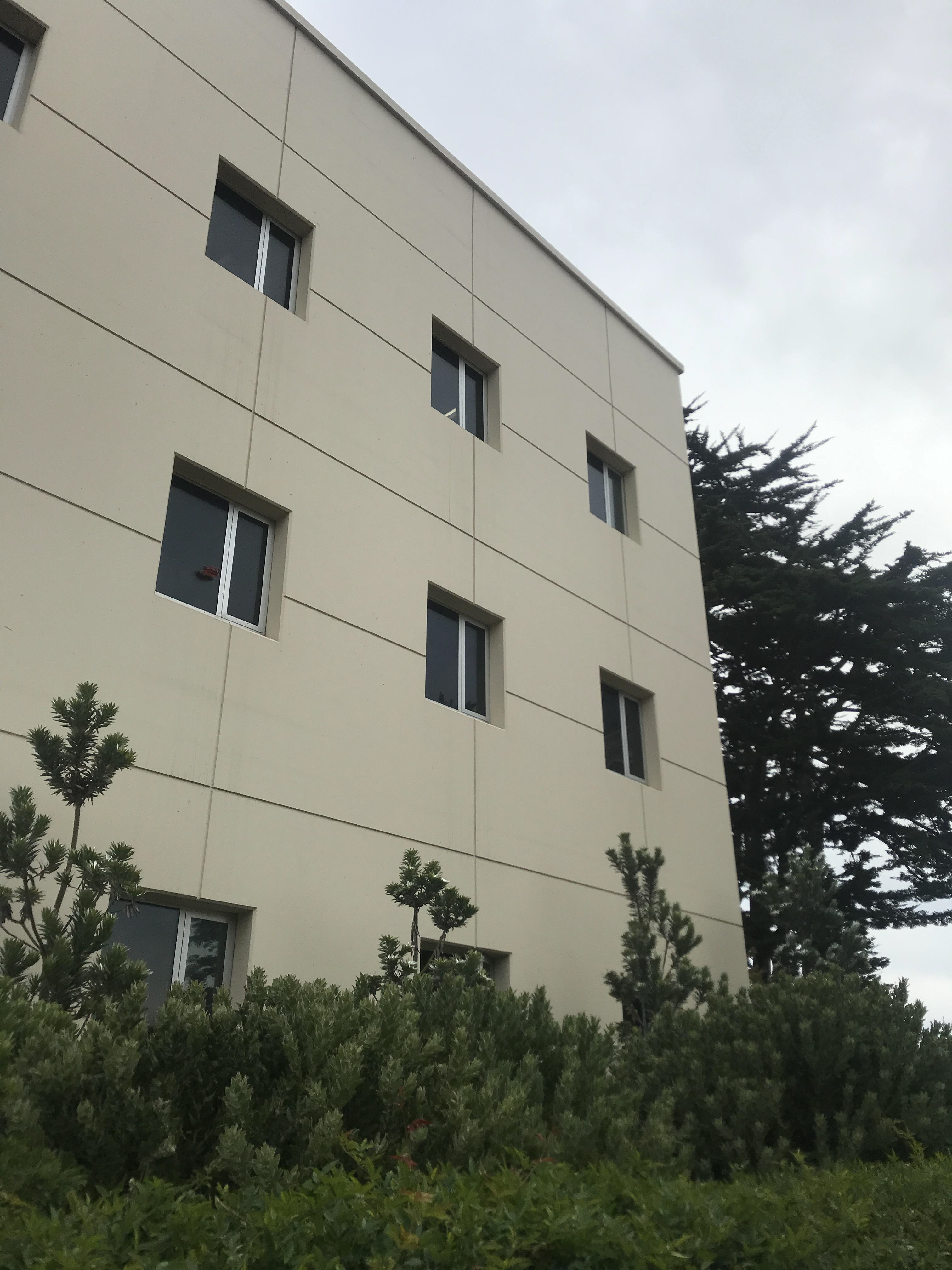
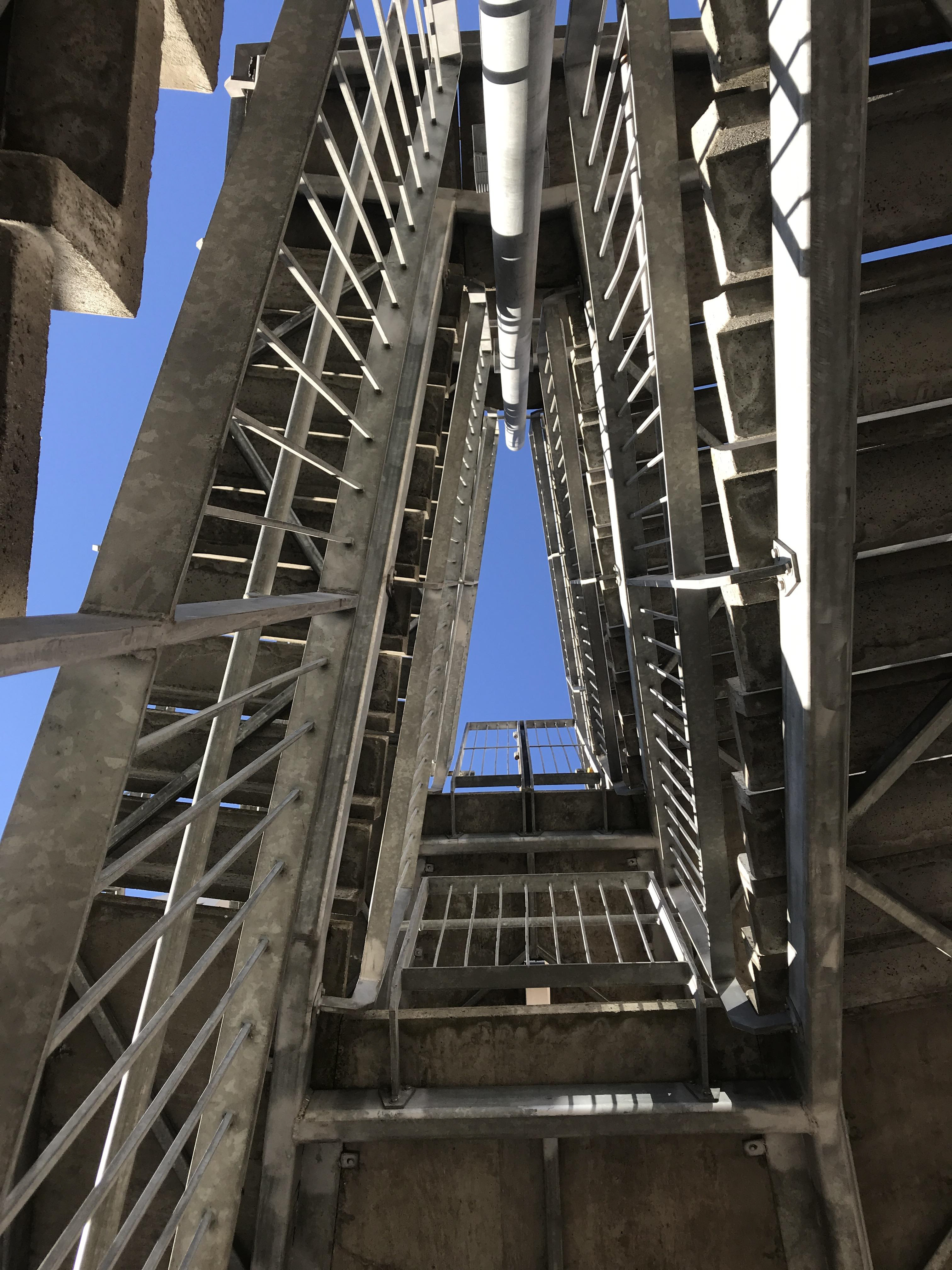
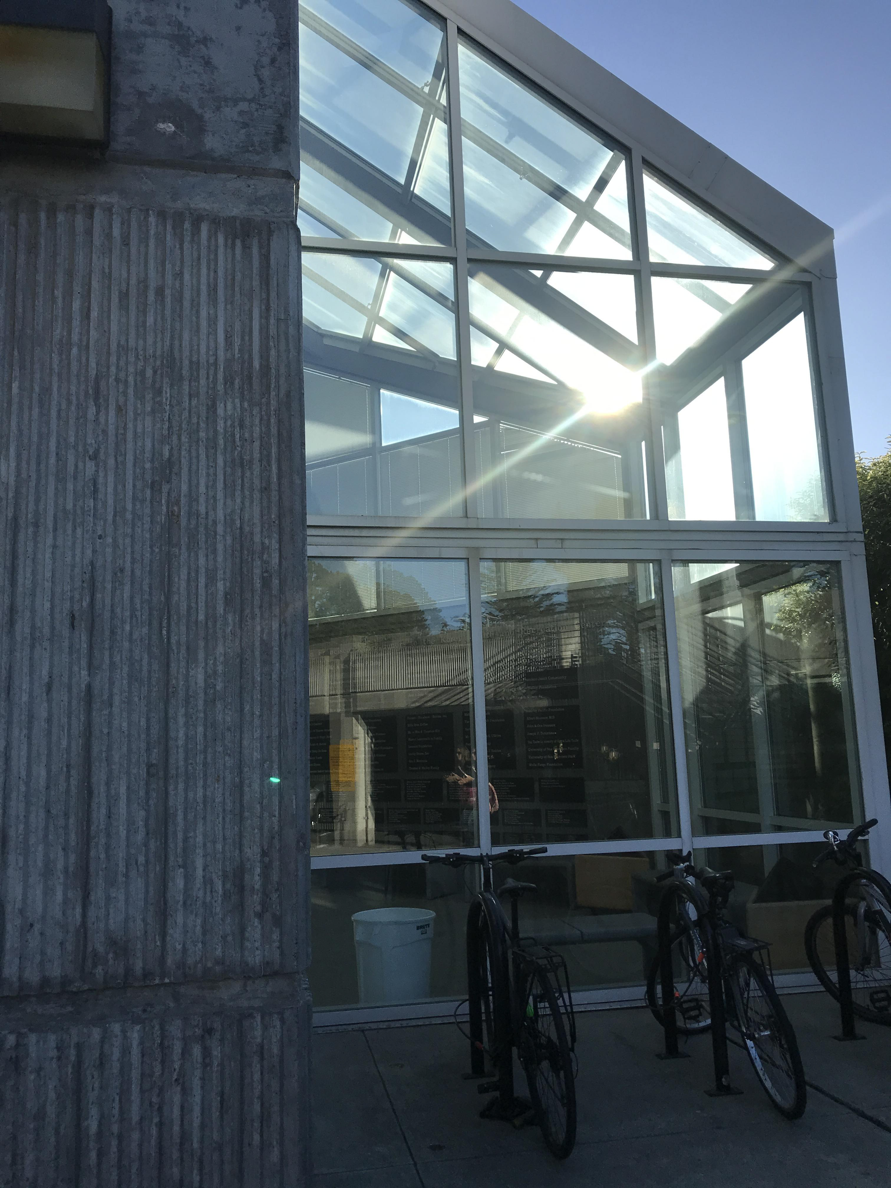
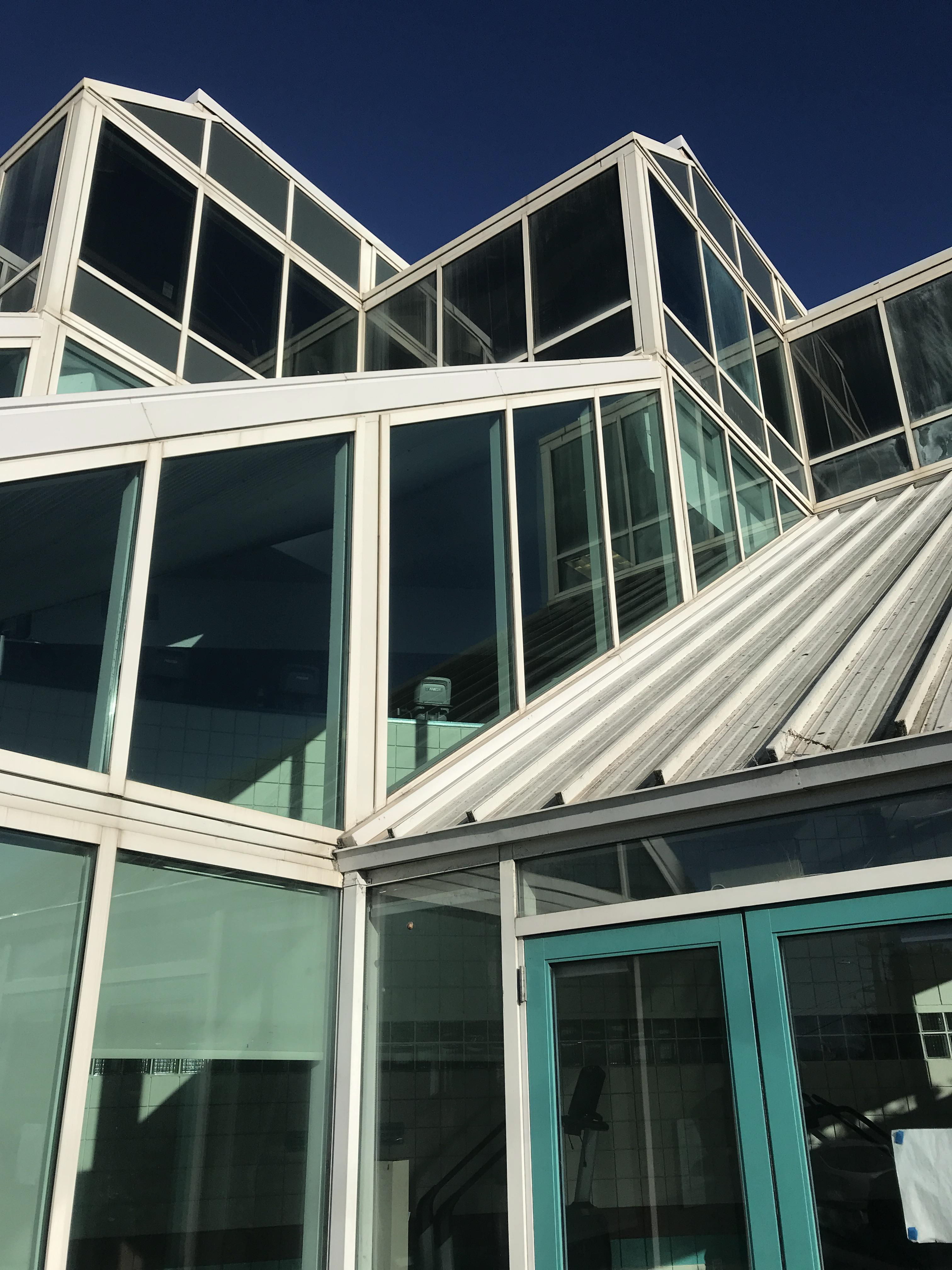
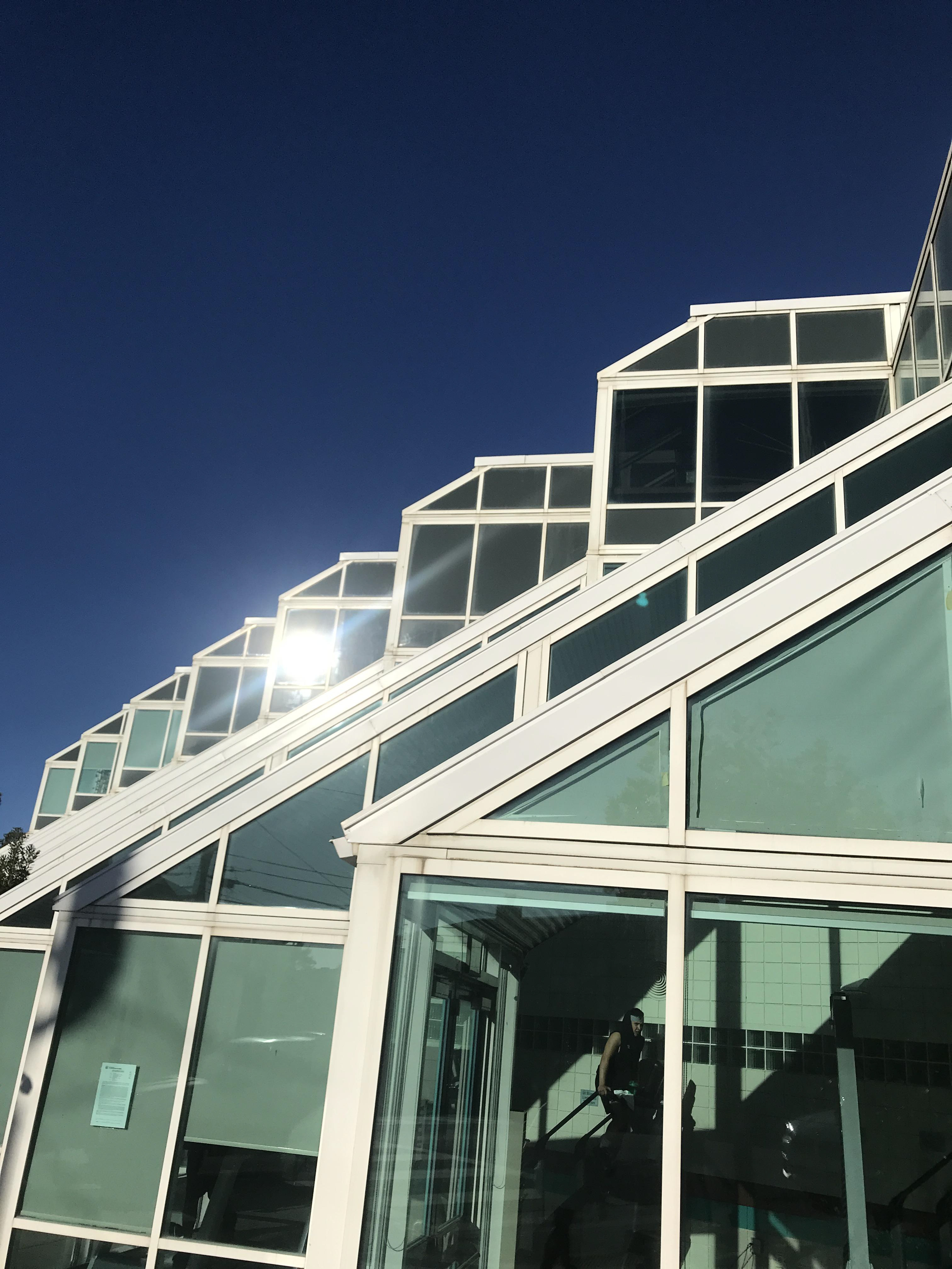
While taking photos, I didn’t really know which direction to go. I didn’t have a concept in mind, so I just started taking a bunch of photos. After importing them to my computer, I created a circular layout. I noticed that the majority of the photos had windows in them, so I concluded that my concept would be windows. After that, I made about 5 different color palettes, and it was very challenging for me to stick to a single color palette.
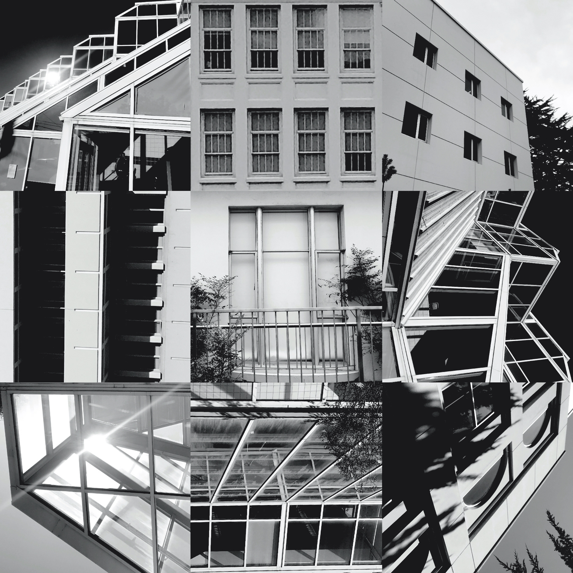
B&W Composition
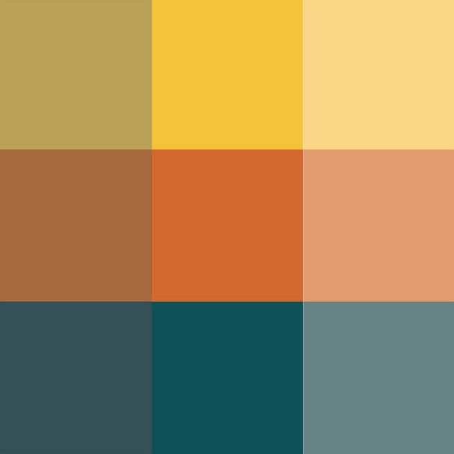
Color Palette Exploration
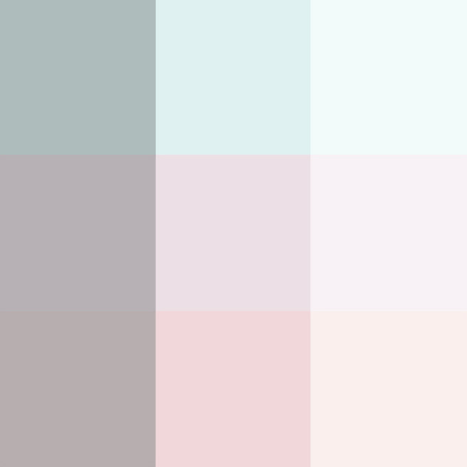
Color Palette Exploration
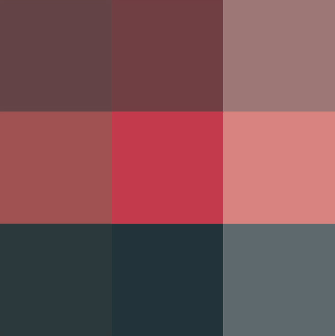
Color Palette Exploration
My final design ended up being pink, blue, and yellow. I wanted the viewer's eyes to vibrate when looking at it. There are many parallel, vertical, horizontal, and diagonal lines. There are different tones, tints, and shades of colors to convey depth, shadows, and perception. The entire piece has a curvilinear shape, and an absence in the center, to give the viewer the feeling that they are looking up or through a tunnel. The scale of the buildings to each other is not proportionate to real life but rather fitted to connect to one another. In areas where the 3x3 squares didn’t look like they fit, I added, extended, and exaggerated lines to make them more cohesive.